
White label trading app
Design
Increase the number of paid subscriptions and enhance user engagement by redesigning the service
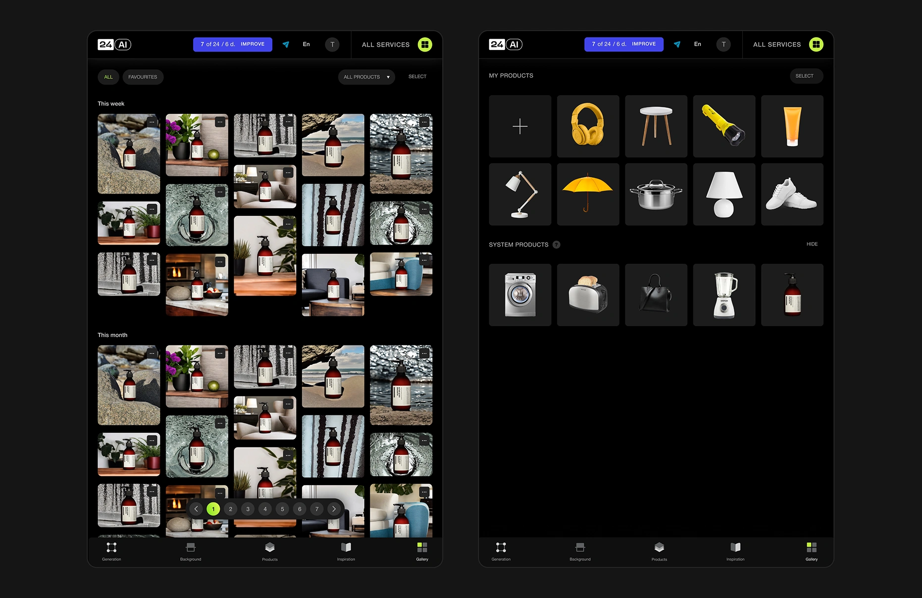
We introduced a dark theme, reduced the sidebar, and replaced text buttons with icons, freeing more space. The workspace was reorganized so most operations fit on a single screen, with a history panel expandable to full size. Navigation was simplified, letting users start testing immediately, while system images can be hidden or restored in account settings.
Raised the conversion rate to paid subscriptions to 20%, effectively solving the main business goal. Increased the number of repeat sessions, average time spent on the site, maximum depth of page views, and conversion to registration.
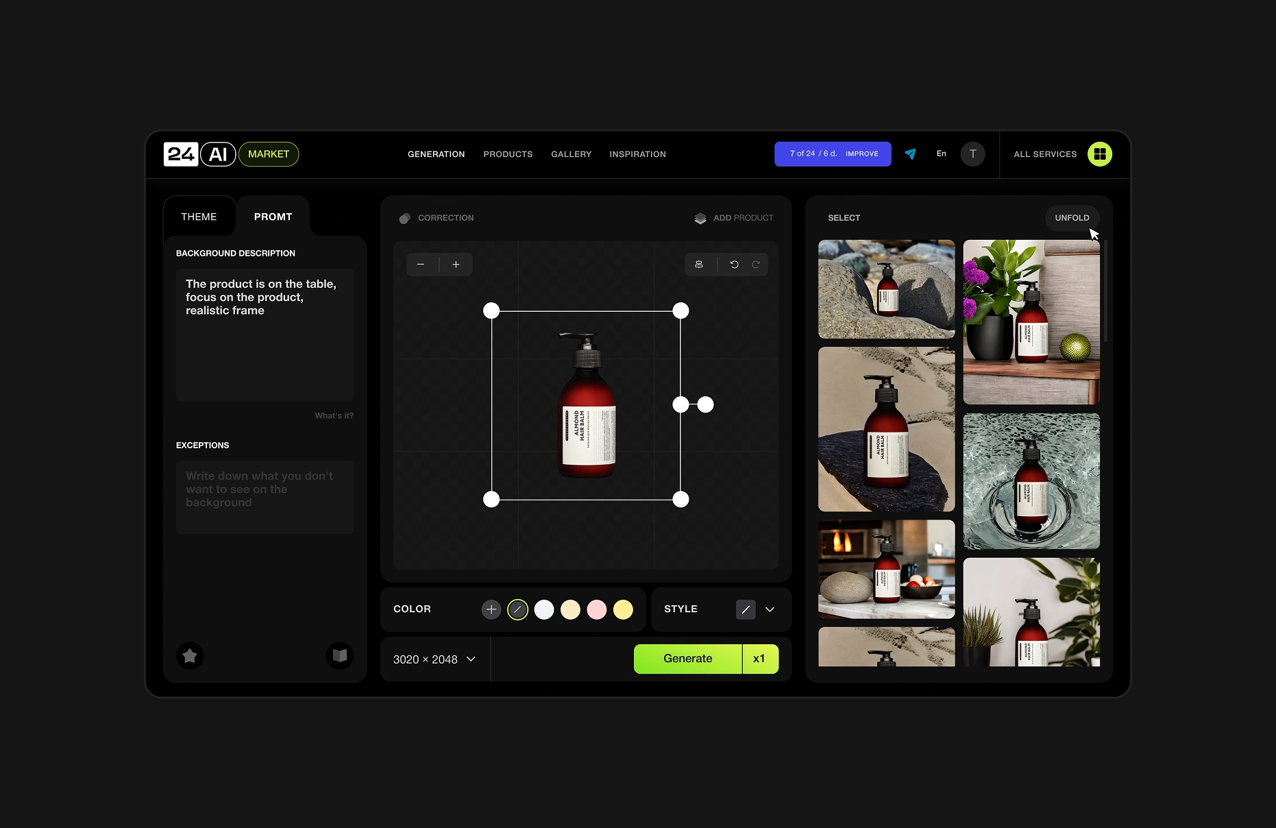
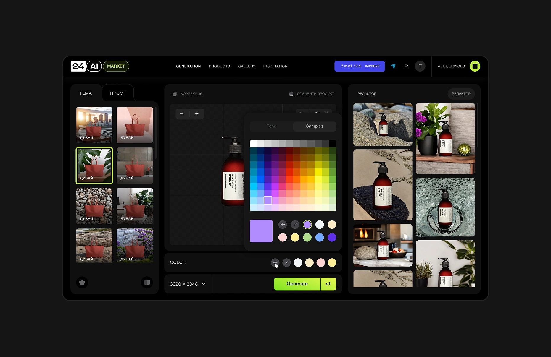
Image resizing no longer causes distortion, and actions can be undone. A "Correction" button improves results, and premium plans allow adding a second product. Object interaction was refined with adaptive frames and a simplified grid. Users can now choose image sizes from a dropdown or set custom proportions.
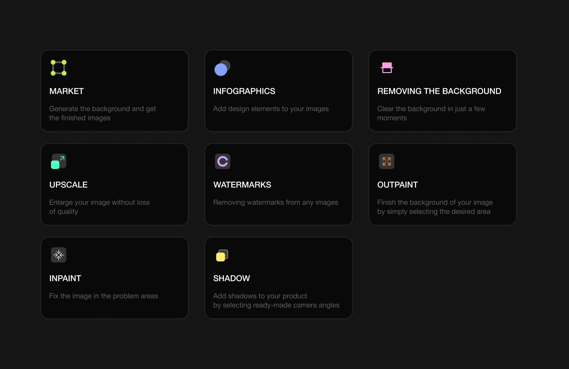
We built seven widgets from scratch and added descriptions to each. The new design streamlined product usage by consolidating all functions and sub-services into one unified system. Users can easily find any tool and switch to another to address different tasks.
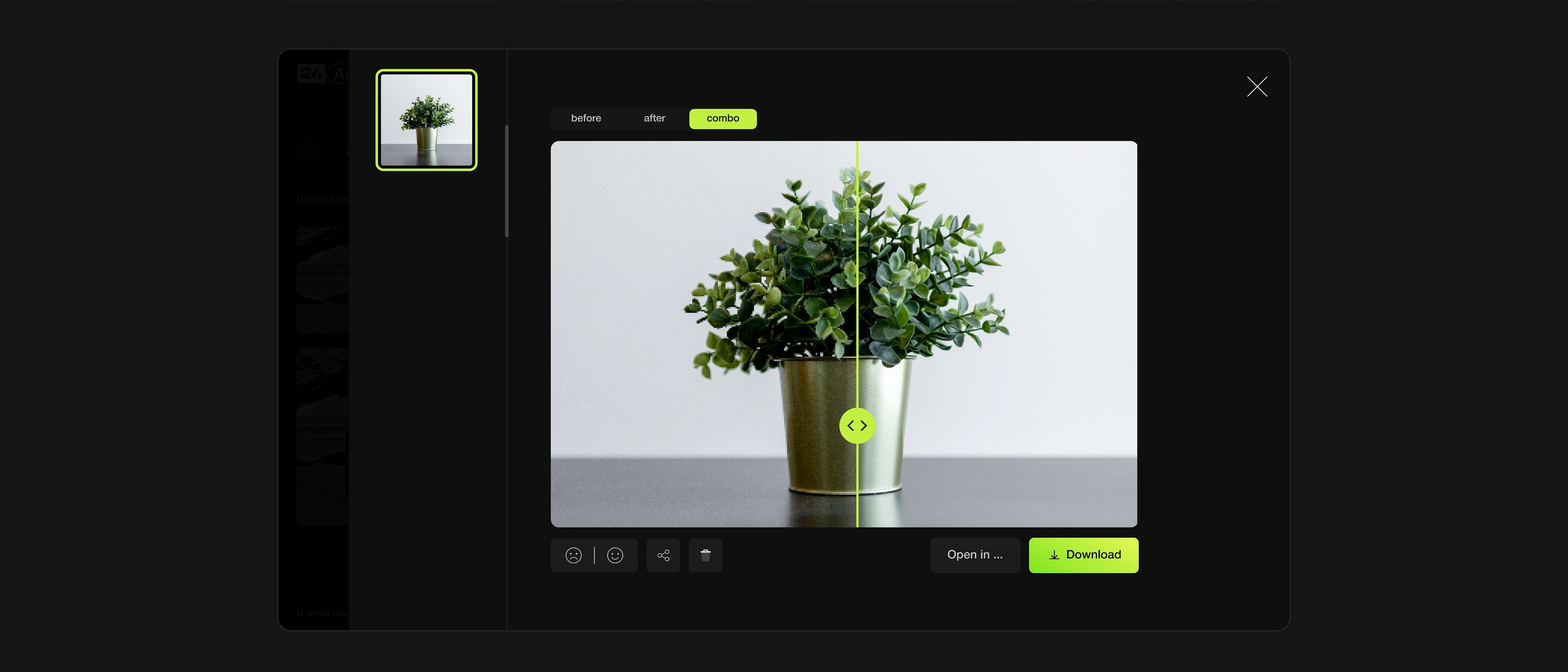
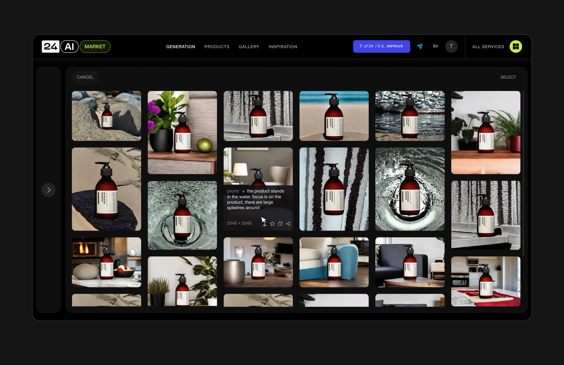
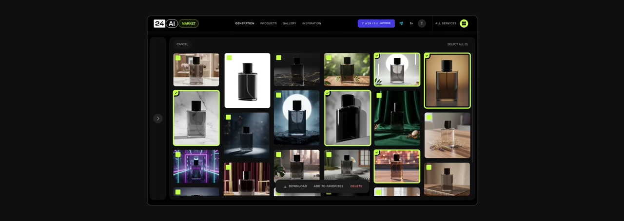
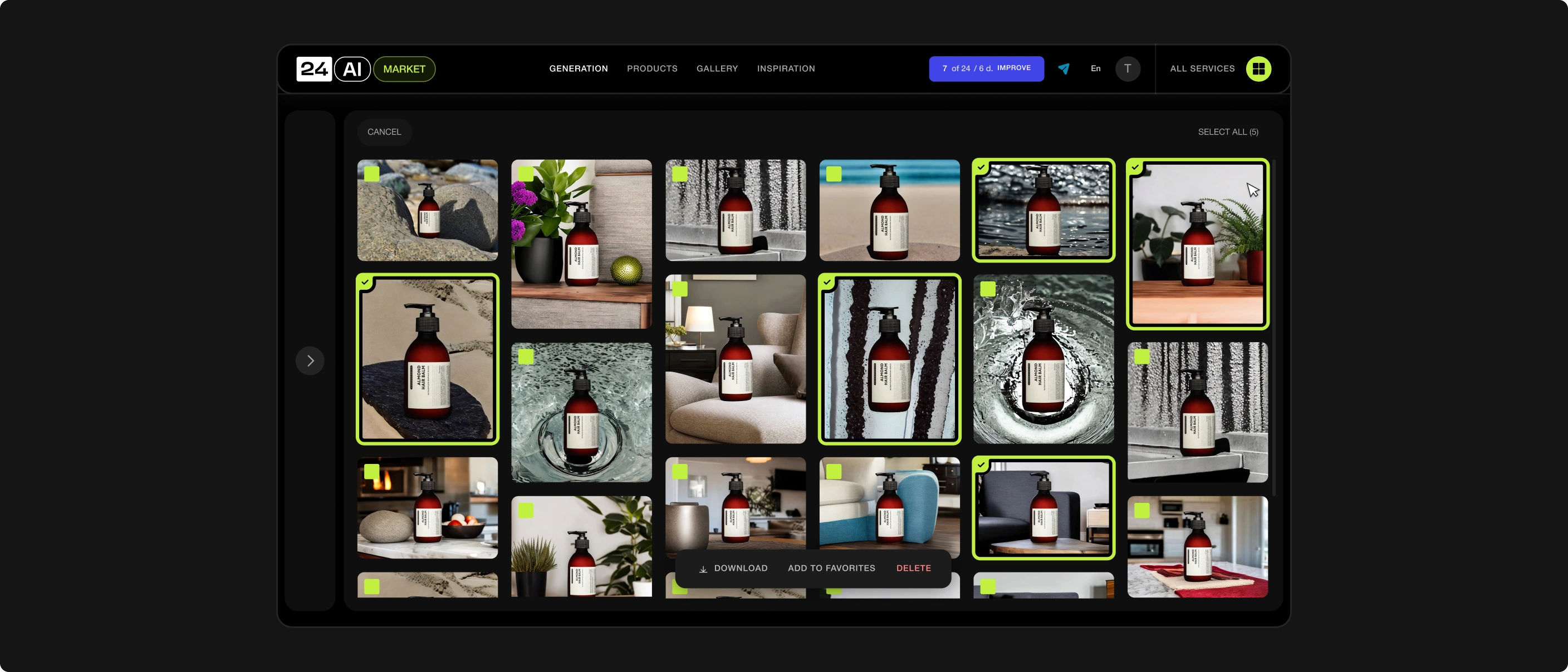
Hover overlays reveal prompts and quick actions (download, view, share). The details window was reorganized, a feed of recent images added, and the interface adapted for mobile. Multi-select enables faster operations with several images at once.
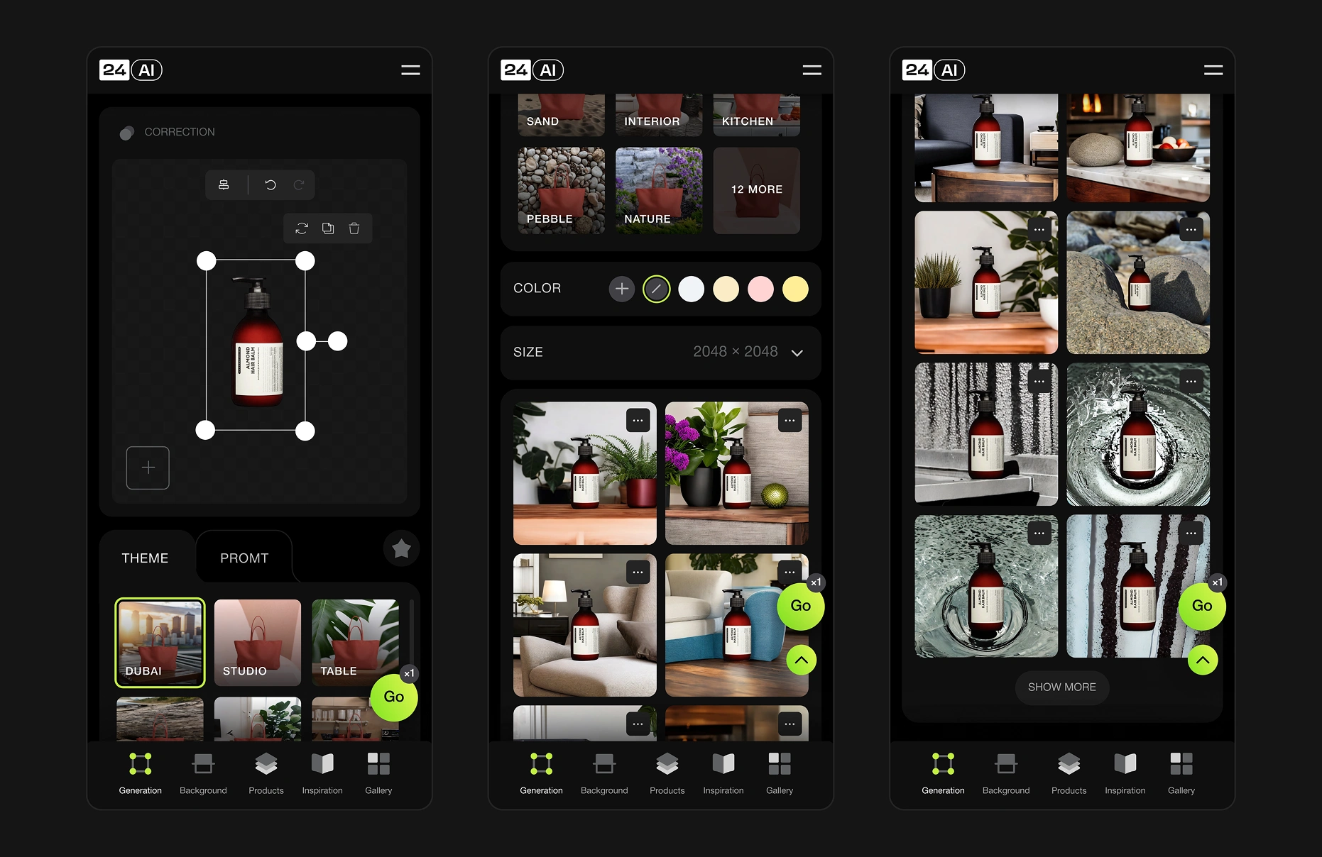
On mobile, a sticky Go button generates up to 10 variants and a quick-scroll button was added. Two new formats appeared: edit for image improvement and Infographics for decoration. Reactions let users rate results and support neural network training.
We didn’t just adapt the service for mobile devices—we created a fully functional in-browser application. The neural network is now comfortably usable on any screen. At widths of 744 px and below, a tab bar appears to simplify navigation between interface sections.
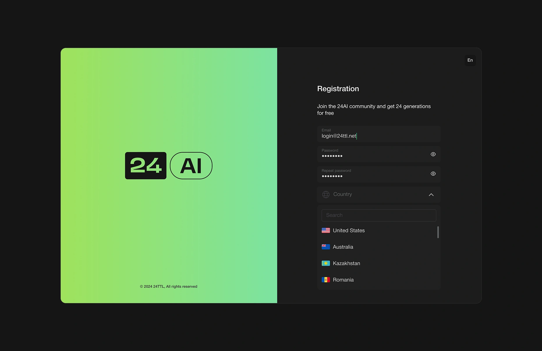
The registration screen was completely rebuilt to align with the client’s business processes. It was styled in the brand’s visual identity for better recognition. A country-selection field was added to improve the payment process with international bank cards.
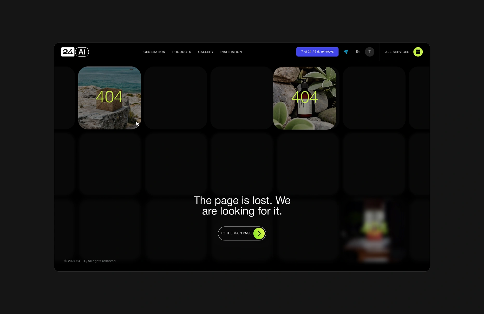
Error pages display past generations with error codes, gradually blurred by depth, accompanied by a short message and a "Back to main page" button. This turns errors into inspiration and increases user loyalty.