
White label trading app
Design
We created an interface for the 24ORM service, which transforms a massive amount of data about product cards, images, prices, and competitive activity into a clear visual platform for e-commerce brands.
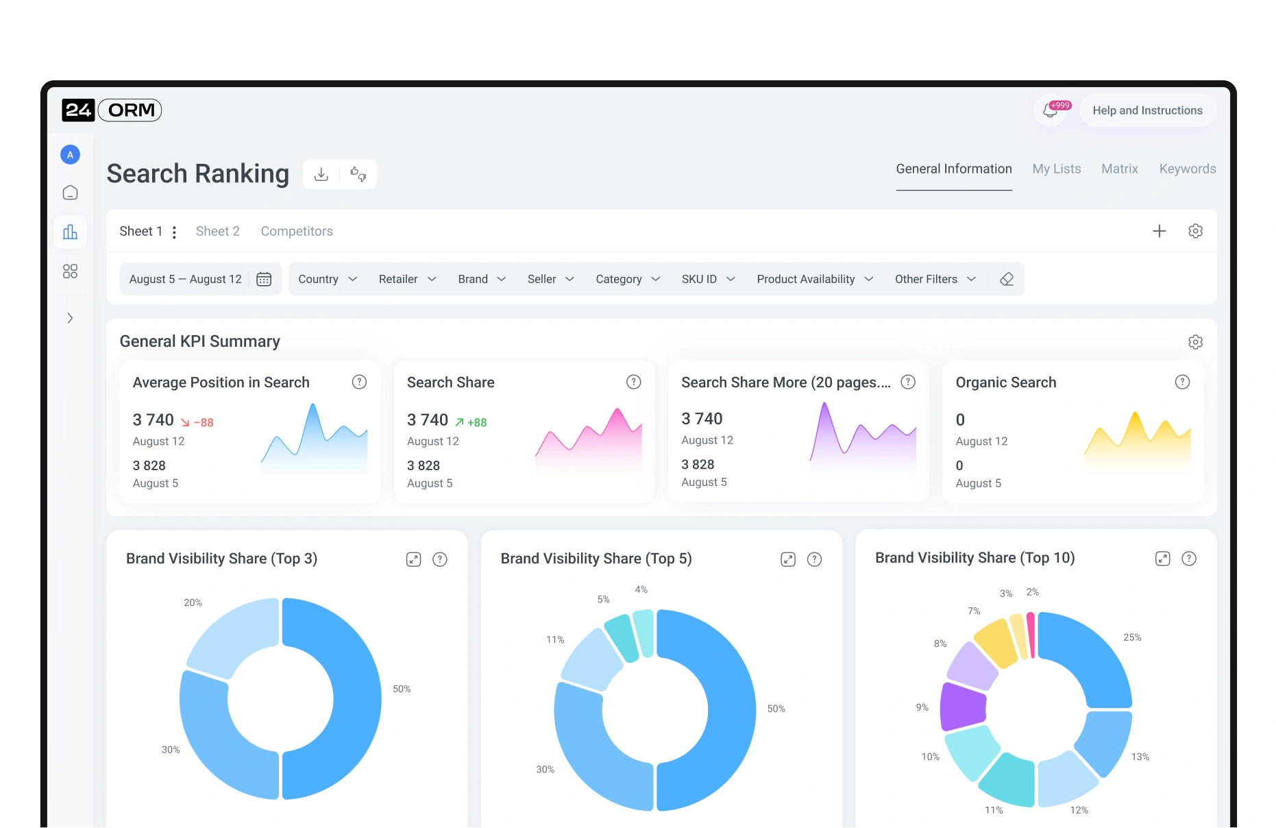
The main page is built around the user’s tasks. Here, they immediately see key reports and can quickly assess the dynamics of the metrics. Date and parameter filters help focus on the necessary data, while screen customization allows the interface to adapt to the user’s workflow.
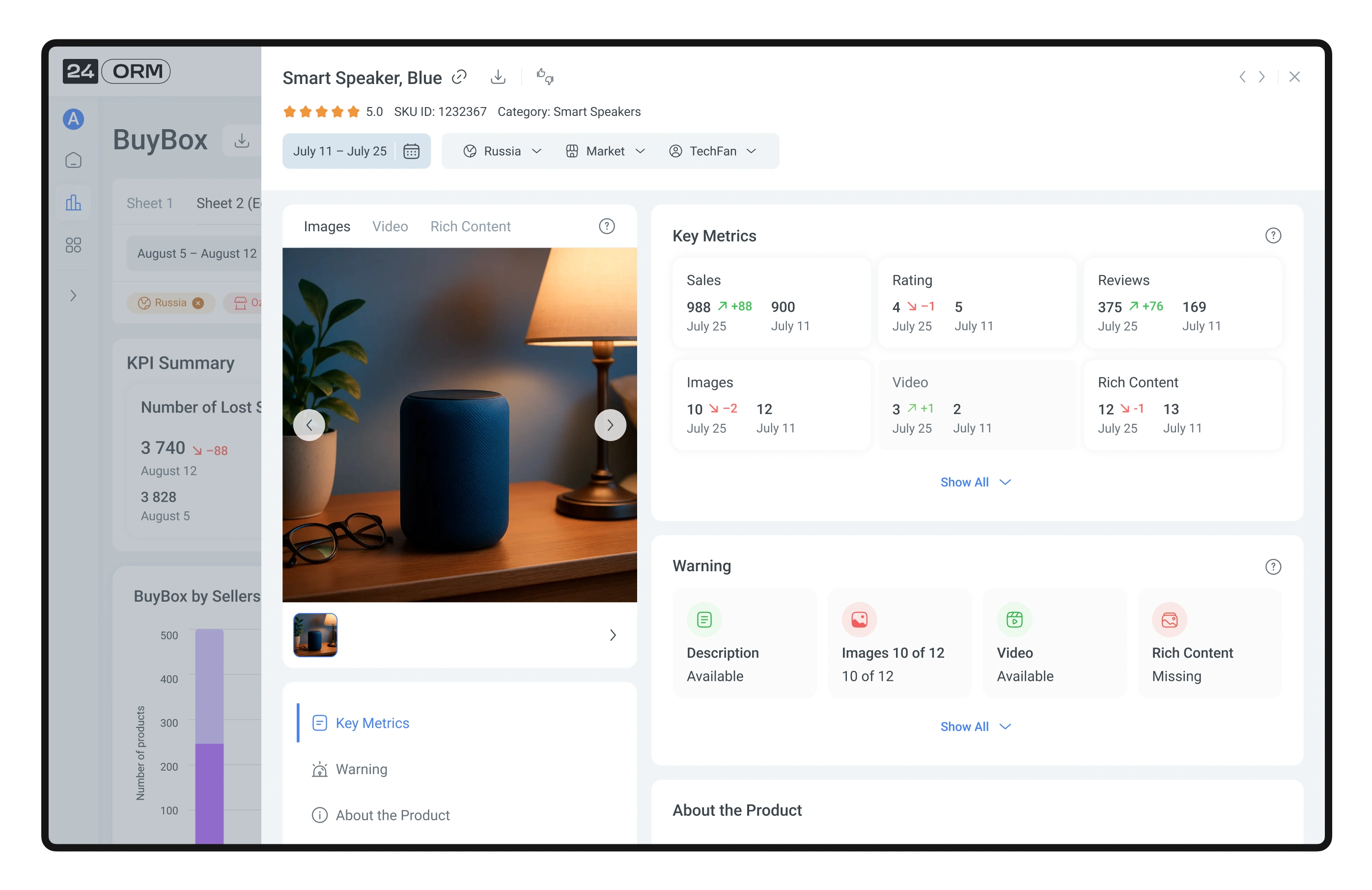
In a separate CMS block, all reports with their core metrics are collected. If any indicator shows negative dynamics, it becomes noticeable at first glance. With one click, the report expands into a detailed table by products—allowing the user to instantly switch from the big picture to concrete actions.
To free up as much space as possible for working with charts, tables, and matrices, navigation is tucked away in a compact hidden menu. It is always within reach but never distracts from the data.
Customizable filtering and saved lists allow the user to quickly adjust data display to their needs—view the necessary metrics, save selections, and return to them with a single click.
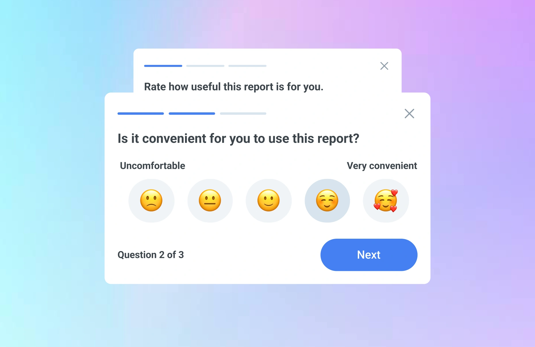
To receive user opinions in time and improve the reports, we added a compact mini-survey. It allows users to quickly share whether the report is convenient to use, whether the functionality is sufficient, and which elements need refinement.
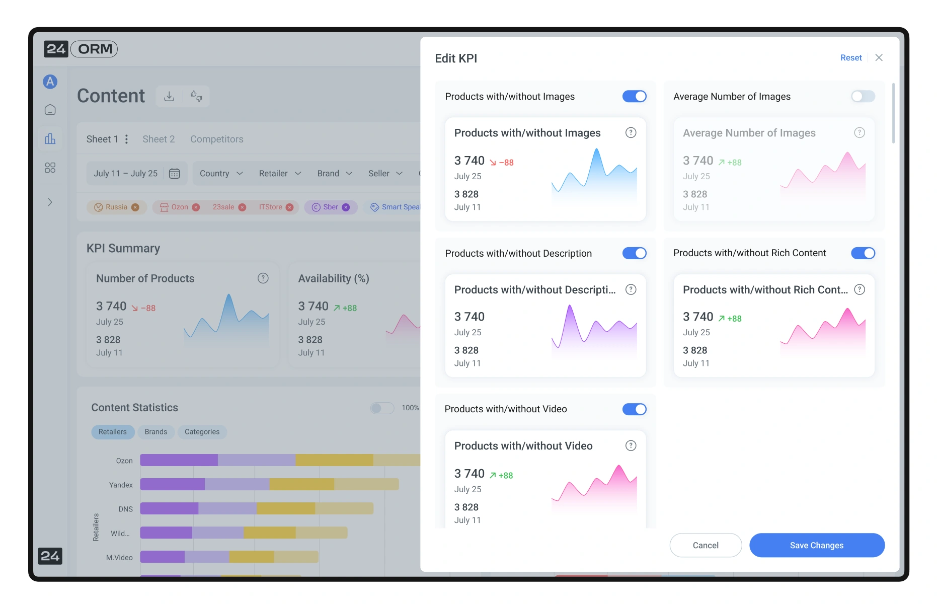
The user can customize KPI display according to their tasks: select needed metrics, manage their number, and adjust the format. All formulas are built into the system—they can be found in the knowledge base or viewed in tooltips. This helps quickly understand the calculation logic and make data-driven decisions.
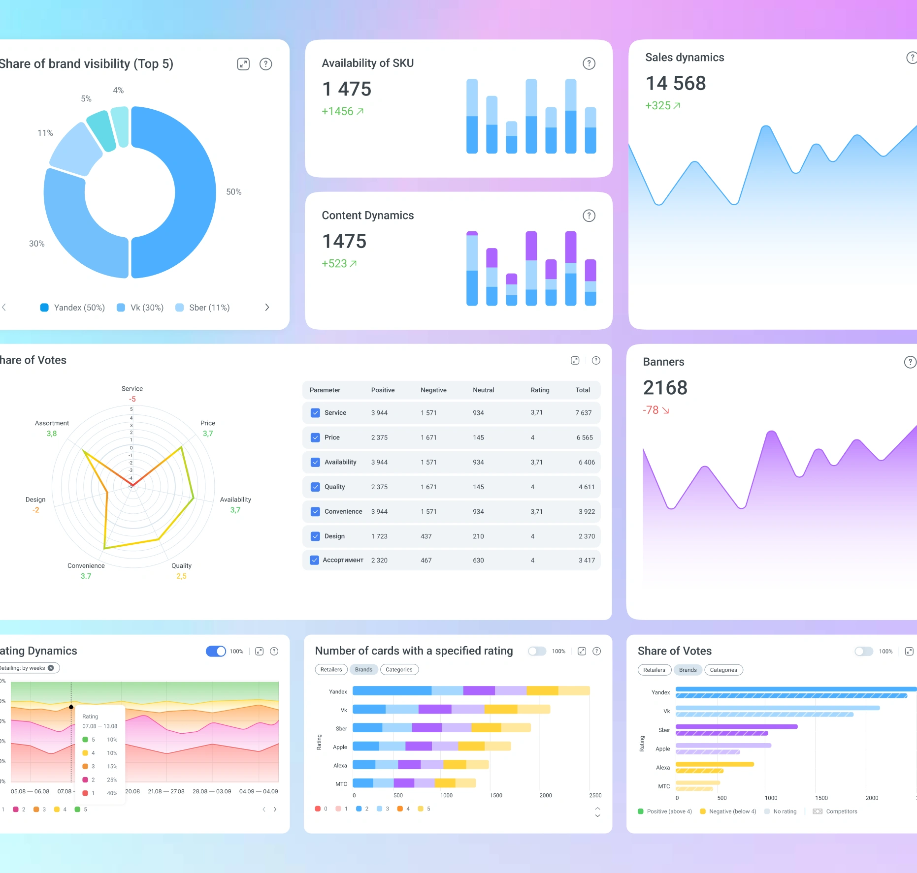
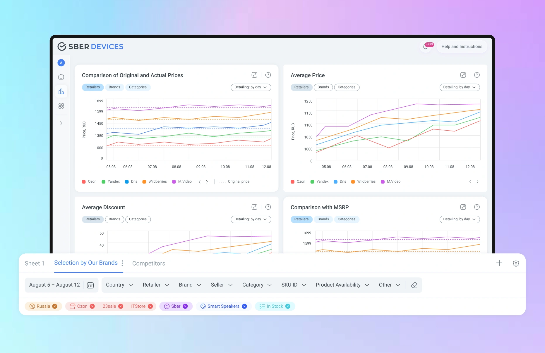
We made the charts interactive: users can compare values, aggregate data by selected periods, and switch display modes—absolute or percentage. The set of functions was formed based on UX testing, leaving only the most convenient and in-demand analysis scenarios.
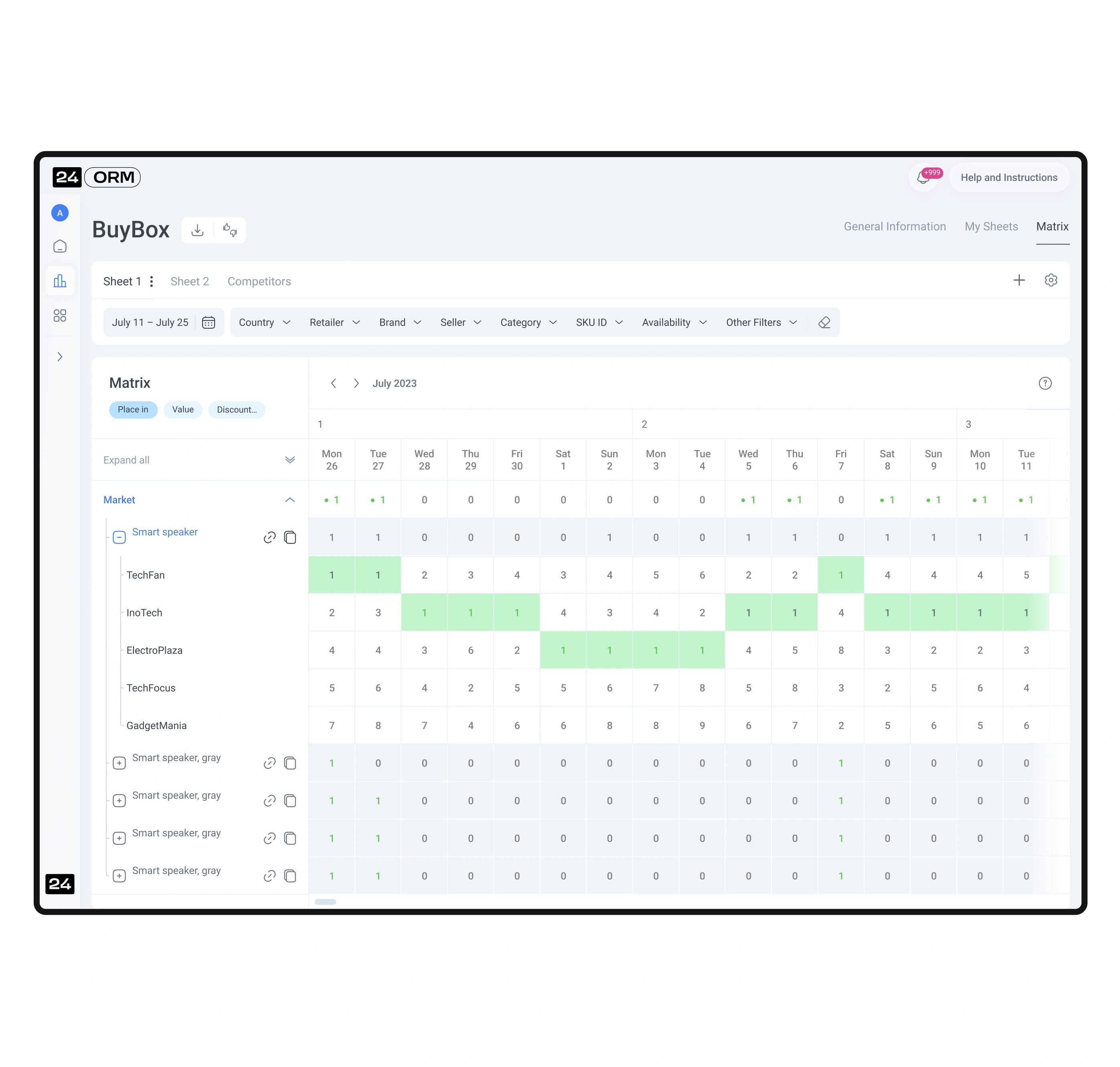
The matrices are designed so that large datasets are read quickly and without cognitive overload. We used color segmentation, heatmaps, and flexible display settings. The user can view the matrix in different formats—for example, in currency or product quantity—and instantly assess key deviations.
The user can upload and update the product list for working with reports in their personal dashboard. During the upload process, each stage is shown to the user. If any errors occur during the upload, the user can see which specific products were affected.
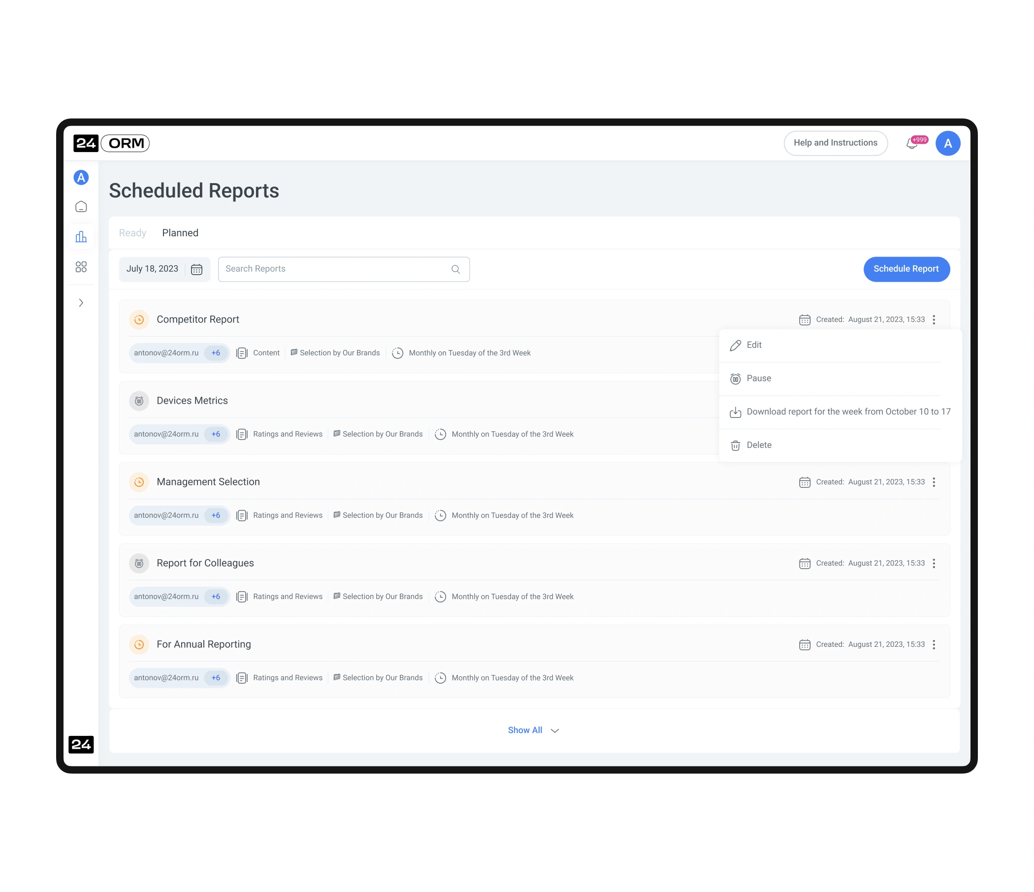
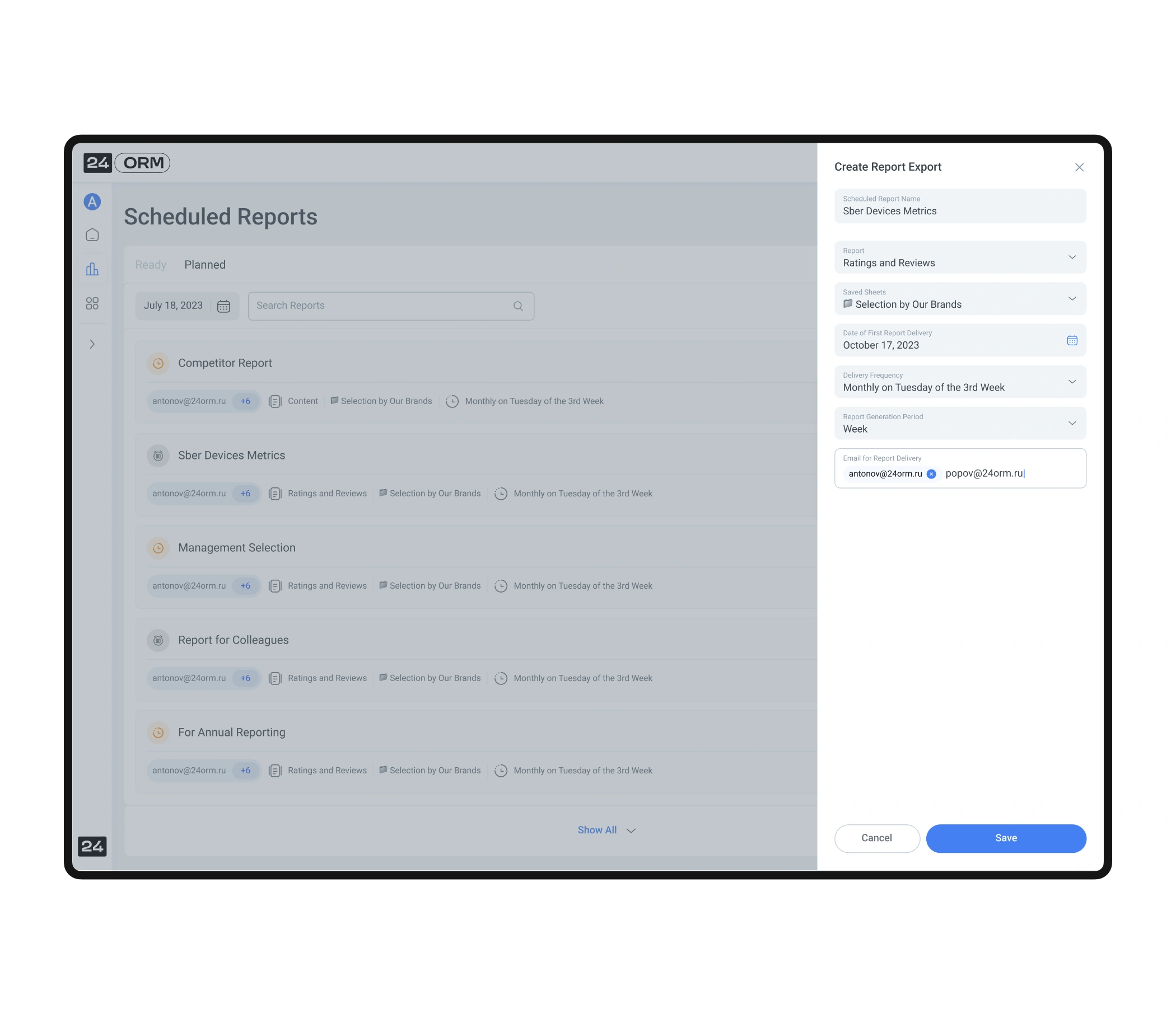
During UX research, users highlighted the need to automate data exports. We implemented a report scheduling feature: users can choose a report, set the date, time, and frequency of delivery. This removes routine work and ensures important data always arrives on time.
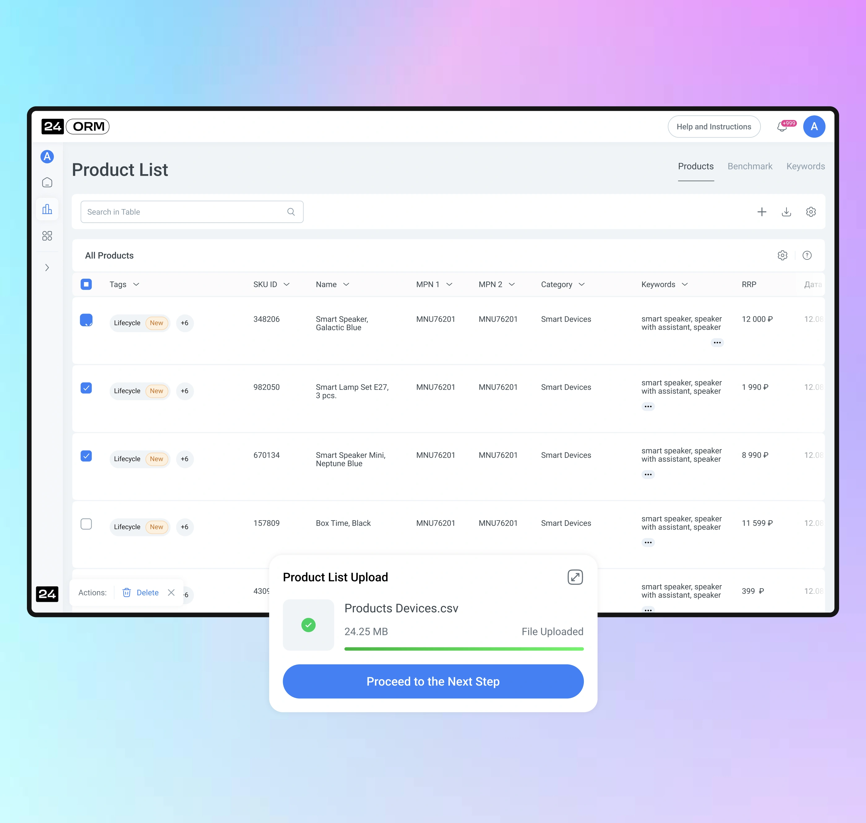
To simplify working with reports, the user can upload and update a product list. The process is divided into clear steps, each visually represented. If any errors occur, the system shows which products they relate to—allowing the user to quickly fix the data and continue working.
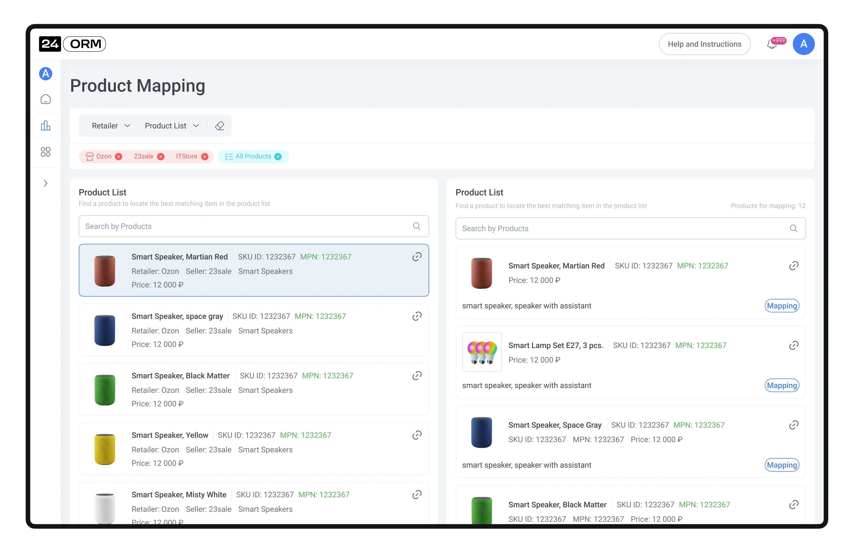
The user quickly finds the necessary products and links them to the product list. This helps correctly merge data, avoid duplication, and maintain calculation accuracy across all reports.
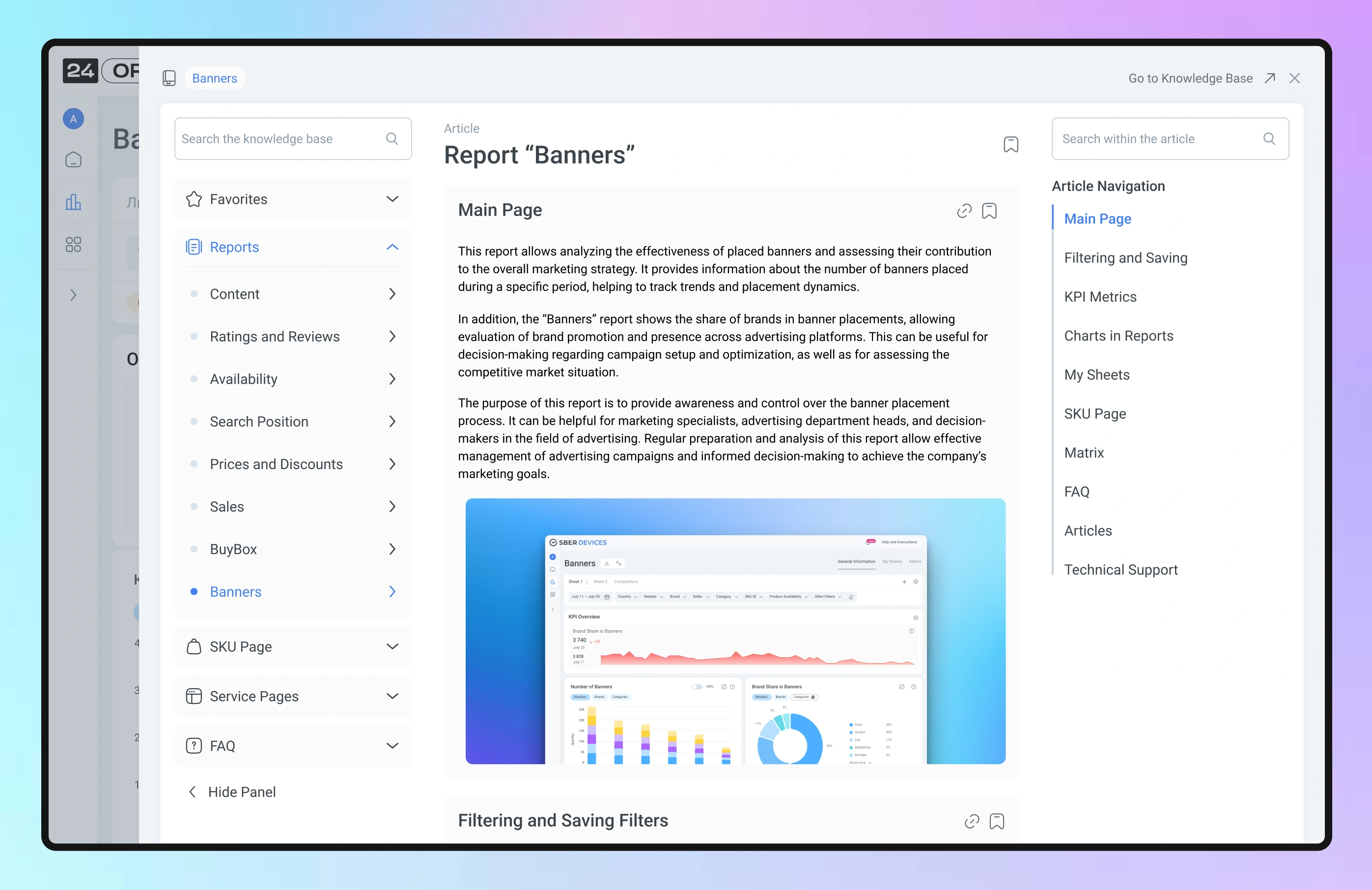
We created a detailed knowledge base that contains instructions for working with the personal account, descriptions of all functionality, and all KPI formulas. This helps users quickly find answers and work efficiently with the service.